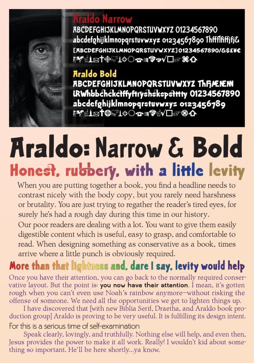
Araldo is a headline font with spunk
 Araldo is a headline font with spunk for today. I needed something with a little life for my new book production group: Biblia Serif, Dreatha, and now Araldo. This new font family is doing well for me.
Biblia Serif and Draetha are both excellent book production font families. In other words, they are not memorable. In fact, if they do their job well, you don’t even notice them.
But as I mention in the flyer to the left (where I’m using these fonts), there come times when you must break out of those restrictions and bring a bit of life into the layout. Araldo was designed to meet that need.
I’m happy to say, it seems to be working well. It’s a little in your face, but not too heavy about it. It seems to give a nice respite in the middle of the seriousness of the day. I’m quite pleased so far. I want to do some more fonts like this, but it’s a good start.
Araldo is a headline font with spunk for today
It’s not meant to be upright and cautious [though as a book design font, of course it is that]. It gives you a chance to recover the tired reader’s eye. Because as you know, almost everyone is tired, often near exhaustion, these days. Even believers can feel the pressure [Biblically called tribulation—with no caps yet].
So, as book designers we need to be nice and kind to our readers. It’s our job as book designers to design our books so that readers will actually read them. It’s awfully hard to do that with the poor choices offered us as ebook designers. In the jungle, we’re probably stuck with our careful font choices being ripped out of our books—even if we embed the fonts. But hey, there are others who will happily sell your books.
So, it’s just a font choice. But it is working well for me. I hope it does for you also.
They’re available at a discount at FontSpring. Let me know if you have any problems, please. [you can email me].
