Font classifications: the lowest common denominators
A practical list
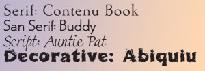
The four basic classifications of all type are:
Of course, most of the so-called Decorative fonts are serif or sans. As you can see above, Abiquiu Fiesta is basically a sans serif. Miscellaneous would be a better term.
We’ll start with the majority: serif typefaces.
Way more than half of all font designs were serif fonts. This overwhelming majority has been diluted a bit by the outpouring of fancy and widely varied scripts in recent years. But serifs still dominate.
Serif fonts have been the dominant standard for body copy typography for 500 years. Only with the new millennium have we seen a genuine movement away from serifs toward newer, more readable sans fonts being released. This basic classification is broken up into sub classes that are bewildering in their complexity. We’ll cover many of them in the coming weeks. But the general consensus of the minimum divisions possible is as follows.
Minimal Serif Font Classifications
If you are new at this, you probably have trouble seeing the differences between Garamond and Baskerville. Of course, this is made more complex if you click on the Garamond links [above or below] and find that MyFonts lists 150 different Garamonds [there’s only 77 different Baskervilles]. But that is all part of my point. Most readers cannot see the differences either.
Old Style fonts: readable and beautiful (1500-1750 or so)
For practical purposes, I include all fonts designed before the mid-eighteenth century in old style except for the German blackletter fonts. That’s how everyone [who is not a type professional] reads them. The distinctions are only interesting to type designers, type nerds, and typographers [like book designers]. But then this is a series of postings for us, isn’t it? Just don’t expect anyone else to care much.
The originals used by Gutenberg were in blackletter [631 varieties], what is commonly referred to as Gothic or Old English [2007 varieties] by most. This has had its own development and I will include it in our discussion of handwriting fonts or scripts after we cover serif and sans serif.
The fonts we are most comfortable reading are those based on character forms from the fifteenth to the eighteenth centuries. I include most of the font designs developed for early printers. These start with the earliest fonts from the Renaissance. Remember printing triggered, or was the enabling technology for, the Renaissance.
These fonts are the standard to which all other fonts are compared. They are full of smooth sensuous curves. They are light, and open—beautiful, comfortable, and elegant. The stems are vertical. The bowls are nearly circular. The crossbars might rise to the right (but usually only with the e). The axis is mostly humanist until the end of the period in the mid-1700s. The aperture is comfortably open. There is enough contrast to help but not enough to dominate. We’ll get into the specifics of these multitudinous fonts beginning next week. Here’s a link to a posting which defines some of these terms.
But before we go…
Humanist axis: All of the basic Oldstyle category uses a slanted axis which was originally roughly caused by the angle in which the pen was held for calligraphy. This axis varies in degrees but is always slanted from upper left to lower right—the basic right-handed bigotry that forms many of the assumptions about type design. But then I’m a little subjective on this topic being sinister myself (a lefty). This is opposed to the Rational axis found in Modern fonts—but more on that in coming weeks.


