Typography for ministry: The reality of picking fonts
The basic parts of type
Again, we need some more basic language definitions. Without it, I can not help you in your ministry.
 You can see above how the point size of the type relates to the ascender, cap height, x-height, baseline, and descender. More importantly, you get a glimpse of things that are important in the world of typography.
This illustration is from an introduction to typography in publishing found in Appendices A & B in my new revised and expanded, Writing in InDesign 2nd Edition, due out this spring. This is my resource to teach believers how to minister in publishing to those you are called to serve.
Other good books on typography
- InDesign Type by Nigel French: This is the best basic book I have seen on setting up type in InDesign
- The Elements of Typographic Style by Robert Bringhurst: This is the industry classic. It’s pretty heavy-duty but an excellent read (a bit dated & anal, though).
- Stop Stealing Sheep by Speikermann & Ginger: The title comes from an old quote by Frederic Goudy who said that anyone who would letterspace lowercase would steal sheep. It’s a very entertaining yet highly informative read.
Not surprisingly, because book designers are typographers, there are many books on the subject. The sad thing is that most of them are very dry, ridiculously technical, and full of strong opinions stated as facts (been guilty of that m’self). Plus, none of them have the attitude of service needed to minister. As you grow in skill as book designer, you’ll probably read several of them. Check out your local library.
What fonts should you use?
One of the goals of all my writings is to teach you good stewardship. You can spend a lot of money on fonts. The good news is that the Creative Suite comes with some excellent fonts for book design. Caslon [131], Garamond [152], Chaparrel, and Minion [2] are four good fonts for body copy. The links are to different versions in MyFonts. The numbers in brackets are the number of different versions found in a quick search there.
The Mac OSX software gives you several more—including those used on the iPad (we talk about what’s available on the iPad in Appendix E about ePUB design in Writing in InDesign 2nd Edition). Baskerville [75], Cochin [11], Hoefler Text, and Optima [42] are quite pretty.
Many of you will also have others installed by various hardware and software you have purchased over the years.
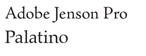
What you are looking for is a professional quality serif font face. Check Font Book on the Mac (in your Applications folder). It is a free piece of software that comes with OSX to install and view the fonts you have installed on your computer. You may be surprised at some of the gems. A couple you probably have are Adobe Jenson Pro [42] and Palatino [17].
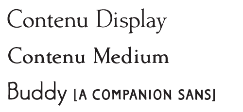
Any of these font families will work for you as you get into the industry and learn your craft. Eventually you will probably buy something special for your taste and style—but it certainly not necessary. If you have any questions about fonts you find on your computer, ask us in the comments. If you like the fonts I am using in my current books, click here to buy now for only $50. I will sell you the 12 Fonts used: Contenu Book (4), Contenu (4), and Buddy (4) for $50. List price is $25 each for the twelve fonts and that’s below average.
Special blog package only $50
Typography is probably the major skill set you will be adding as you learn to publish your own books. It is essential to enable you to communicate clearly and accurately to your sheep and the people to whom God gives the opportunity to help.
For today you need to remember that good fonts purchased from a reputable supplier are essential. All of these fonts mentioned will work well for you in print. For your ePUBs and Kindle versions there is another whole set of problems which we will cover in other postings.
As mentioned, InDesign naturally tends to produce good typography—unlike Word. In Word it is very difficult to do excellent typography. In fact, many of the things you need are impossible in Word. I do not use Word processors unless forced to do so. Their documents were a horror when I received them as raw copy when I was working full-time as a graphic designer. In fact, I developed a relatively extensive list of steps to completely strip out word processor formatting to enable good typography to be added within InDesign (that’s also in Writing In InDesign 2nd Edition). I cannot state it too forcefully.
Word processors cannot do
what we need to do as book designers!
We will cover many more of these things as we continue in this series. If there is anything you want me to cover mention it in the comments.
Related articles
- Book Typography Part 3 What makes good fonts for a book (hackberry-fonts.com)
- Book typography: Part 2: Picking fonts (hackberry-fonts.com)
- Book Typography: Part 5: What is a Humanist sans? (hackberry-fonts.com)


